If you run a boutique, you’ve probably noticed this: the same cashmere piece can feel like a $200 item or a $500 item — depending entirely on how you display it.
Cashmere already carries luxury signals. Soft, light, finely textured. But if it’s displayed like a general wholesale garment, those signals disappear. Customers walk past instead of reaching out to touch.
This post isn’t about generic visual merchandising theory. It’s 5 specific, actionable display moves built for small boutiques stocking wholesale or white-label cashmere — all aimed at one goal: letting your customers see (and feel) the value before they look at the price.
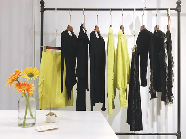
Move 1: Lead With Touch — The “Please Feel This” Display
Cashmere’s biggest selling point is tactile. The moment someone picks it up and feels it, the price objection starts to dissolve.
And yet many boutique owners keep cashmere in protected spots, folded tight or hung out of easy reach. This blocks the exact moment that would close the sale.
How to do it:
- Keep 2–3 “touch demo” pieces unfolded and accessible on a low table or display surface — no packaging, no plastic wrapping.
- Add a small printed care card next to them (a simple “Hand wash. Lay flat to dry.” card is enough). This signals quality without you saying a word.
- If you’re showing multiple colorways of the same style, fan them out side by side so customers can feel and compare.
The logic: Once someone touches cashmere, they’re not deciding whether it’s expensive — they’re deciding whether they can justify it. That’s a very different conversation.
Move 2: Group by Color, Not by Style
The most common boutique display mistake is hanging every style on the rack, sorted by size. For cashmere, this approach is a missed opportunity.
How to do it:
- Build your display around color families, not style categories.
- Mix different styles (cardigan, crewneck, dress) within a single color zone to suggest a complete look.
- Cap each color group at 6 pieces. Less is more.
Suggested color groupings (relevant for this season):
Ivory + Oatmeal + Desert Tan → “Quiet luxury” zone
Steel Blue + Charcoal Grey → “Urban edit” zone
When customers see a color story, they don’t browse — they land. They’re not picking a style; they’re picking a feeling. Decisions come faster.
Move 3: Give Cashmere Room to Breathe
Cashmere squeezed between fast-fashion pieces loses its perceived value immediately.
How to do it:
- Designate a dedicated “cashmere zone” — even if it’s just 3–4 feet of rail space. Create a visual gap between it and the rest of your inventory.
- Leave at least 2 inches of space between each hanging piece.
- If budget allows, upgrade to wooden or brushed metal hangers for the cashmere section. The hanger is part of the product experience at the premium end.
The underlying principle: Density signals discount. Space signals value. This is why every luxury brand retail floor feels slightly “empty” by normal retail standards.
Move 4: Pick One Hero Piece Per Zone
Every display zone needs one hero — the piece you want customers to notice first.
How to do it:
- Choose the strongest piece in terms of color or silhouette, and give it the prime real estate (center, elevated, or front-facing fold).
- Style it with intention: a cardigan layered over a crewneck, or a simple knit dress on a form. Show context, not just the product.
- Keep the area immediately around the hero clean. No competing visual noise.
This matters especially for white-label pieces. If you’ve tagged a wholesale cashmere style with your own branding and hangtag, a hero display position makes it look like a designed, exclusive piece — not a sourced commodity.
Move 5: Warm Light Is Your Cheapest Upgrade
Quality cashmere has a subtle natural sheen. Under warm light, this texture becomes visible and becomes part of the perceived value. Under cold fluorescent light, it just looks like another sweater.
How to do it:
- Aim for 2700K–3000K bulbs in your cashmere zone (warm white, not cool white).
- If possible, add a small adjustable spotlight aimed at your folded display surface.
- Never let cashmere be in a backlit or shadow-heavy zone — it flattens the color and kills the texture.
A quick test: Take a photo of your cashmere display on your phone. If the photo doesn’t make you want to buy it, the problem is almost always the lighting.
Final Thought: Display Is Part of Your Buying Strategy
Getting your cashmere display right isn’t just about aesthetics — it directly affects:
- Average order value: Customers pay full price more readily when the display communicates value.
- Reorder decisions: A well-displayed cashmere section tends to sell faster and more consistently, which makes your next buying decision easier.
- White-label potential: If you’re building a house-label knitwear line, display is how you convert a wholesale piece into a perceived branded product.
A practical self-test for your next store visit: Put your phone down, stand at the entrance, and look at your cashmere zone as a customer. Ask yourself three things: What do I see first? Where is the most expensive piece, and can I see it immediately? Is there at least one piece I want to reach out and touch? Those three answers tell you exactly where to start.
At Cawoolyang, we work with boutiques at different stages — some are testing cashmere for the first time with a small ready-to-ship order, others are building consistent seasonal assortments with white-label options.
If you’re thinking about adding cashmere to your boutique this season, get in touch — we’re happy to help you figure out the right starting point.
FAQ
Q: Do I need expensive display fixtures to make cashmere look premium?
A: No — and this is a common misconception. The quality of your fixtures matters less than the discipline of your display. Wooden or brushed metal hangers help, but what matters more is consistent spacing, clean surfaces, and good lighting. A folded cashmere piece on a clean white linen cloth in natural light will outperform the same piece on a velvet hanger in bad lighting every time.
Q: How do I create a hero display for a white-label cashmere piece without looking like a generic wholesale product?
A: The three things that make a white-label piece feel designed: (1) a branded hangtag and care label that matches your store’s visual identity; (2) a styled context — don’t display the cardigan flat, style it with at least one other piece; (3) a dedicated, named section — “The Signature Collection” or “Our House Cashmere” creates perceived exclusivity. These are low-cost, high-impact moves that transform how a wholesale piece is perceived.
Q: How often should I change the cashmere display?
A: For seasonal pieces, we recommend refreshing the display with each new delivery — typically every 4–6 weeks. Within a season, refresh the touch demo pieces (which get handled most) and rearrange the color groupings when you notice the display looking “settled.” A display that stops changing signals to customers that nothing new is happening.
Q: What’s the biggest display mistake boutique owners make with cashmere?
A: Displaying cashmere too protectively. When pieces are wrapped, folded too tightly, or placed out of reach, you’re sending an unconscious signal that the product is fragile or not meant to be touched. Cashmere’s tactile quality is its biggest selling point — the display should invite touch, not prevent it.
See more content: